The Idea
I built a NCAA March Madness Draft pool webapp that I have run manually on a shared Excel spreadsheet for over 20 years. It took about 40 hours to build, test and deploy.
The Miss: I thought replacing the analog grid with a simple automated data-driven leaderboard was a no-brainer.
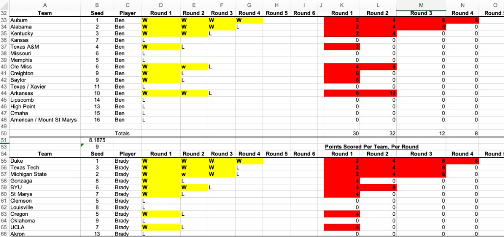
Most features were obvious upgrades — live scoring, automated mobile leaderboard, customizable pool configuration, AI analysis, auto emails. One feature felt like a clear throw-away and an artifact of Excel's limitations: the round-by-round grid showing every team each person picked, color-coded for wins and losses. This ugly grid also happened to be how the spreadsheet calculated scores and stored results. It was visually heavy and clearly redundant once a proper leaderboard was built. It was an easy cut.
The A-ha Moment: The grid wasn't a limitation. It was the experience.
I heard quickly from pool participants that they wanted the old excel grid back.
While the leaderboard tells you where you stand, the grid shows you why you're there: at a glance, across every round, for every pick. Without it, the leaderboard was accurate but lifeless.
This took the first day of games to learn, and fifteen minutes to fix and add back. This time the execution was cleaner, simpler, more compact and scannable -- see below. (UI can be easy, the UX is hard).
What I missed: There was great value hidden inside the grid function which did the hard job of communicating the complexity of what was happening at the intersection of the draft order, pick values, your round status and win totals in a simple visualization.
Before: Excel pool tracker grid.
After: Agentic webapp product grid UX